Vive Cosmetics
Brand Identity · Art Direction · Packaging
Refining a beloved identity while preserving what made it Vive.
Vive Cosmetics is an independent Latina-owned beauty brand with a loyal community and an identity deeply rooted in cultura. When founders Leslie and Joanna approached me to evolve the brand, the challenge was to create something more contemporary and refined without losing the joy, personality, and cultural connection that had made Vive resonate with its audience.
Working independently as a freelance designer and art director, I developed a new visual identity centered around an updated logo, refreshed color palette, playful graphic language, and supporting brand guidelines. The new system preserved Vive’s bold spirit while giving the brand a more considered foundation for its next chapter.
ROLE
Freelance Designer / Art Director
SCOPE
Brand Strategy
Visual Identity
Logo Design
Color & Graphic System
Brand Guidelines
Packaging Design
TOOLS
Adobe Illustrator · Adobe Photoshop
WEBSITE
vivecosmetics.com
Evolution Without Erasure
Vive didn’t need to become a different brand. It needed room to grow.
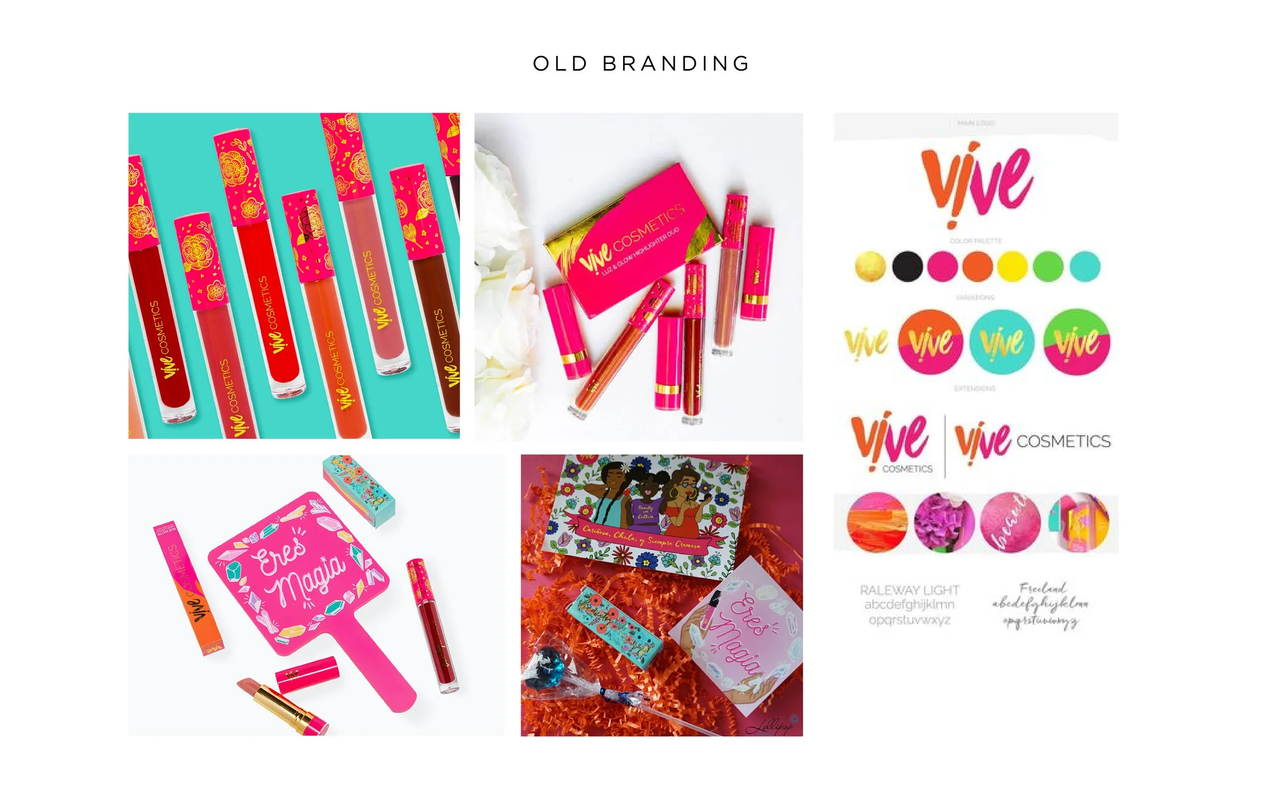
The existing identity had built meaningful recognition within its community, but its script-driven visual language no longer reflected where the founders wanted to take the brand. The challenge was to introduce a more contemporary point of view while protecting the color, energy, and cultural pride that were already unmistakably Vive.
Rooted in Cultura
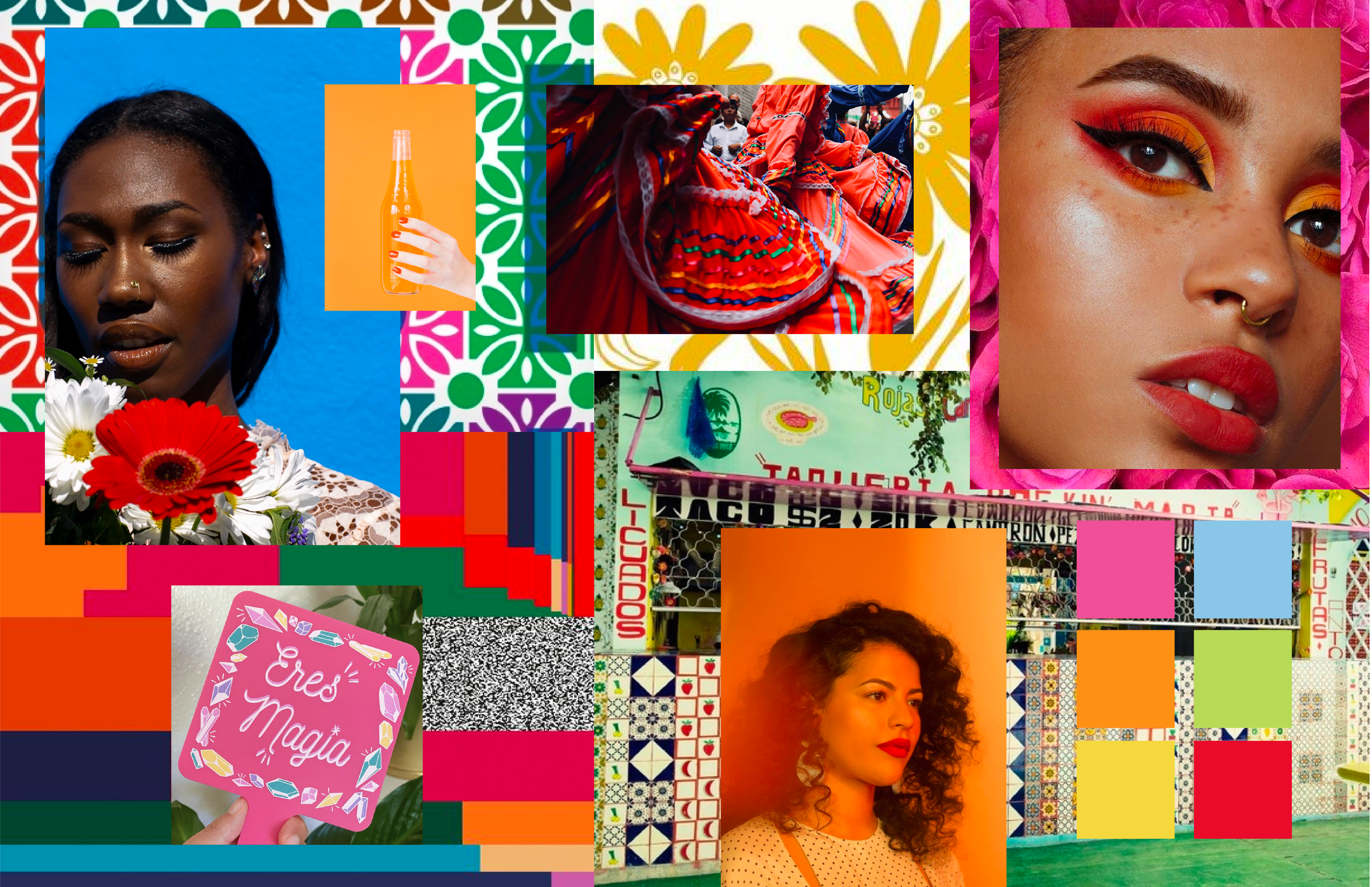
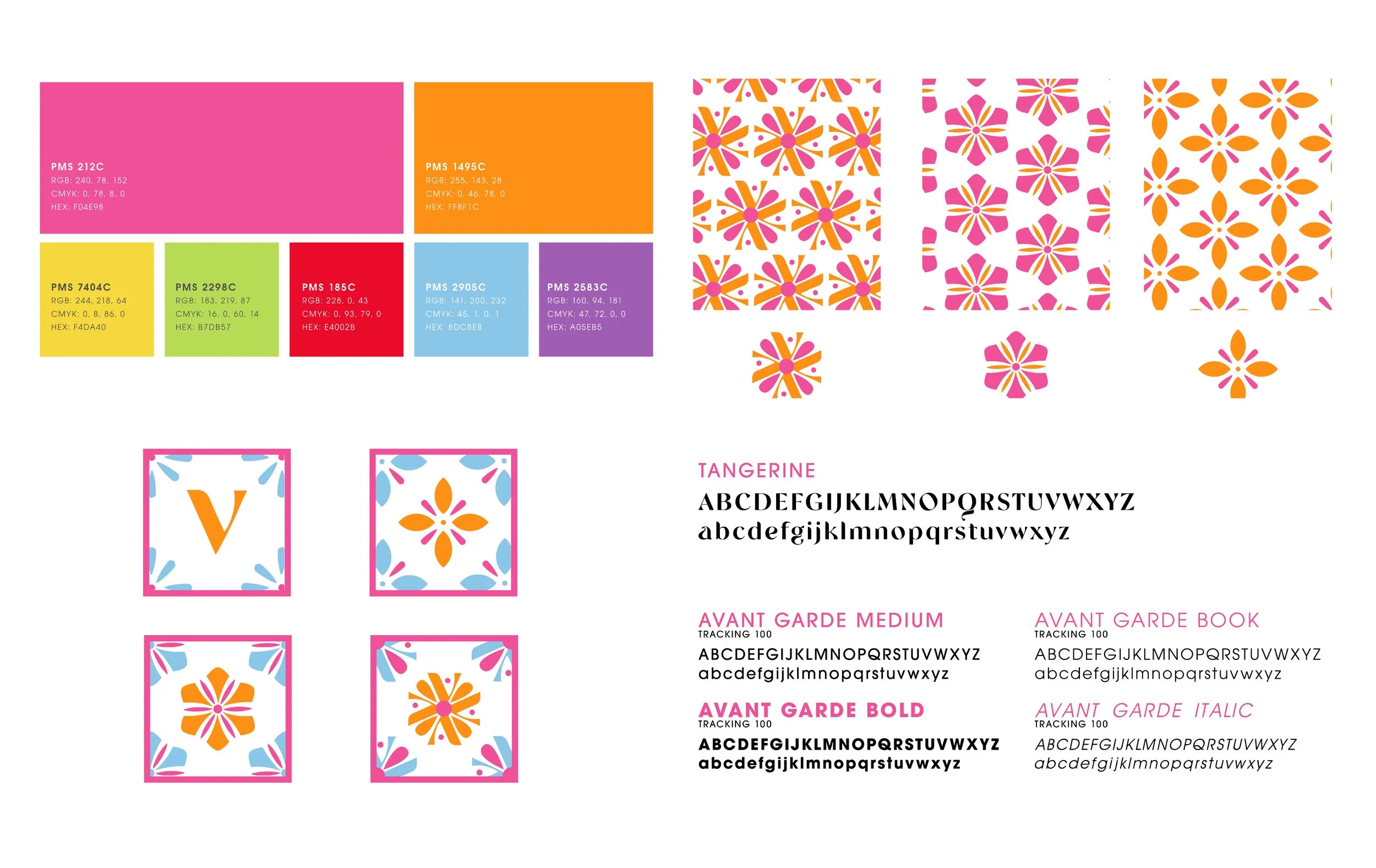
The new direction began with the same positioning Vive always had: cultura. Rather than relying on overt cultural cues, I explored how color, pattern, typography, and form could carry that influence in a more contemporary way. I also incorporated geometric florals, since florals were a heavy part of the brand positioning.
Drawing from our shared Latina backgrounds and visual references, including Mexican decorative tilework, I began building a language of bold color and playful geometric forms that felt culturally familiar without becoming overly literal.
Color remained central to Vive’s identity. Rather than abandoning the palette audiences already associated with the brand, I evolved familiar hues into brighter, more energized tones and expanded them into a flexible system.
Playful geometric forms inspired by decorative tile patterns added another layer of expression, giving the identity a recognizable graphic language that could shift, combine, and evolve across applications.
Finding the New Vive
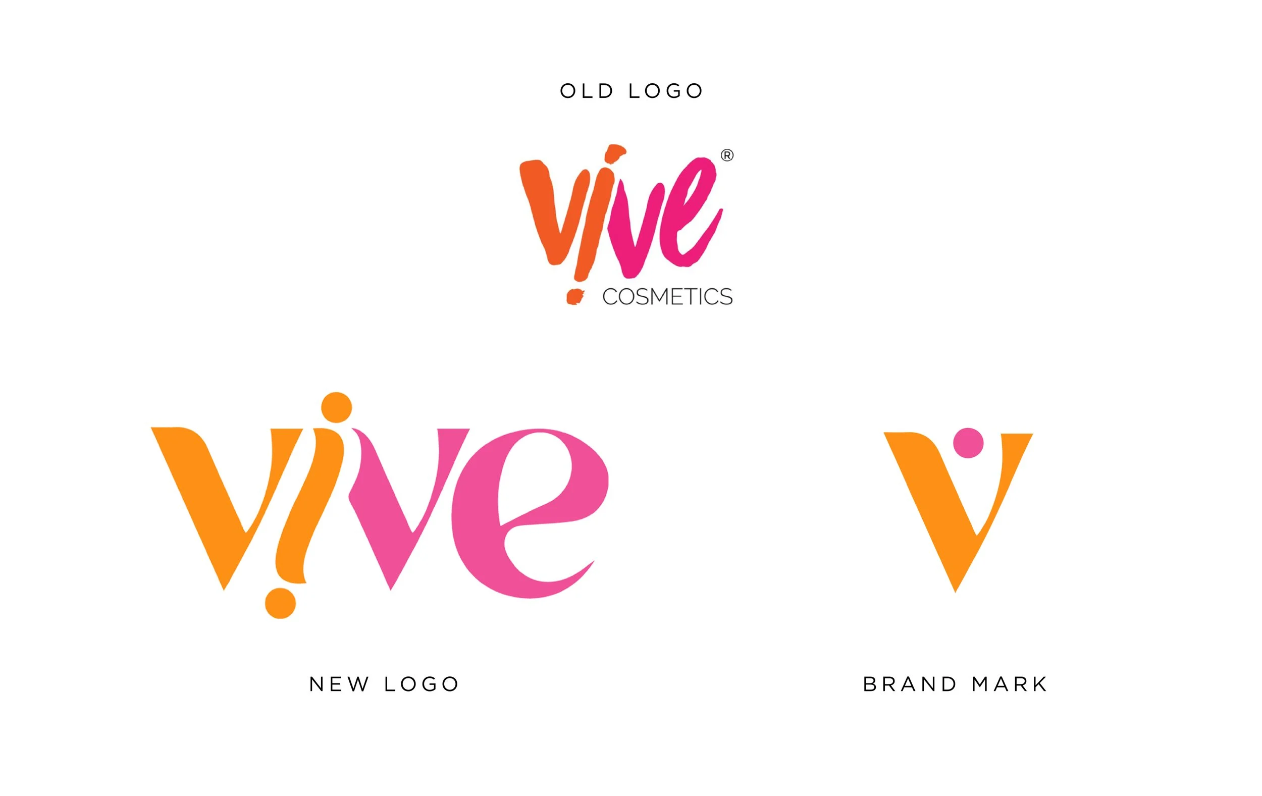
The logo evolution focused on moving away from the brand’s previous script-driven identity toward something cleaner, more contemporary, and more versatile.
Through exploration of form, proportion, and typography, the final mark created a stronger foundation for the brand while retaining the warmth and personality that kept it from feeling overly polished or disconnected from its roots.
A System Built to Grow
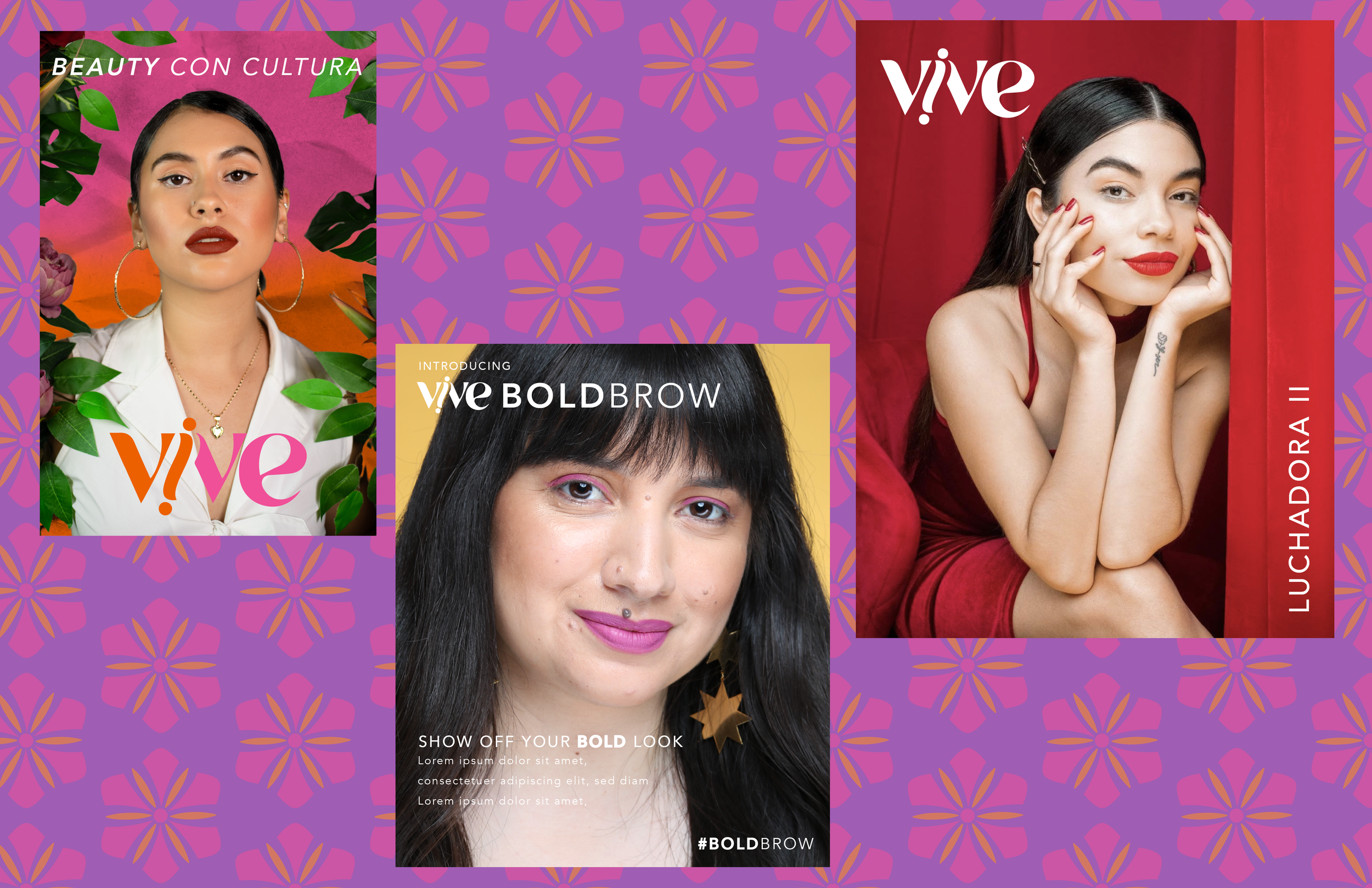
The final identity brings logo, typography, color, and graphic elements together into a flexible system designed to feel unmistakably Vive across different applications.
Brand guidelines established a foundation for consistency moving forward, giving the team the tools to preserve the identity while continuing to evolve the brand beyond the initial launch.
Packaging
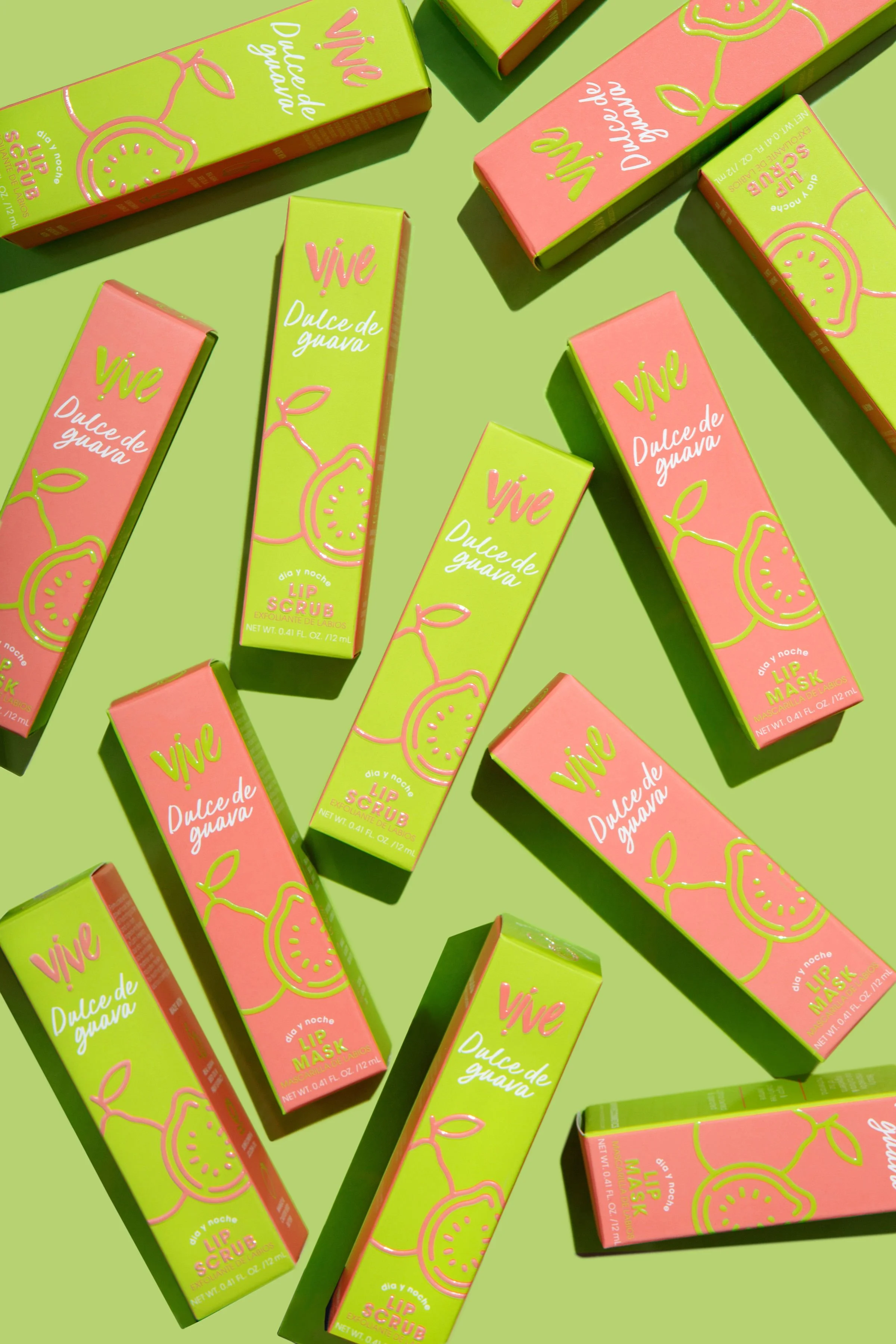
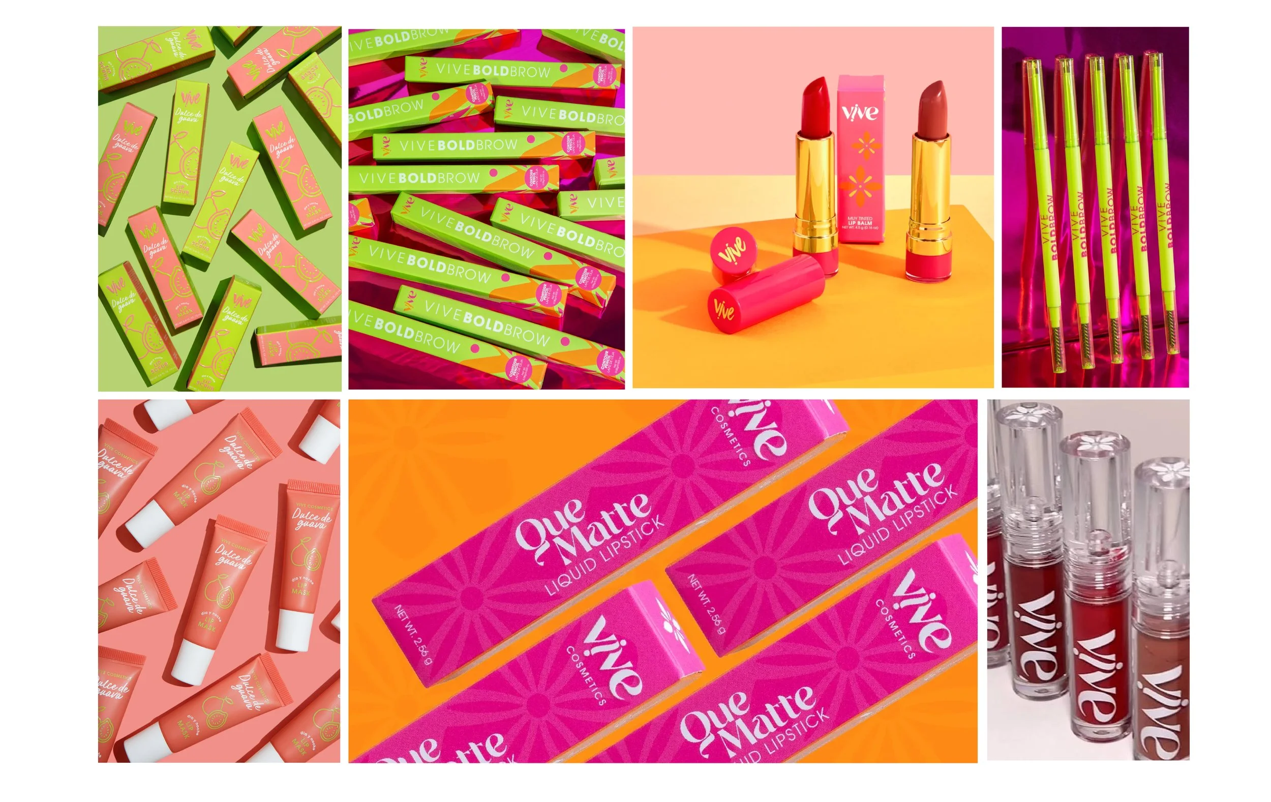
The evolved identity was first extended into packaging through two new product launches. These applications provided an opportunity to translate the refreshed color, typography, and graphic language into a physical expression of the brand while establishing a direction future products could build from.
A New Chapter for Vive
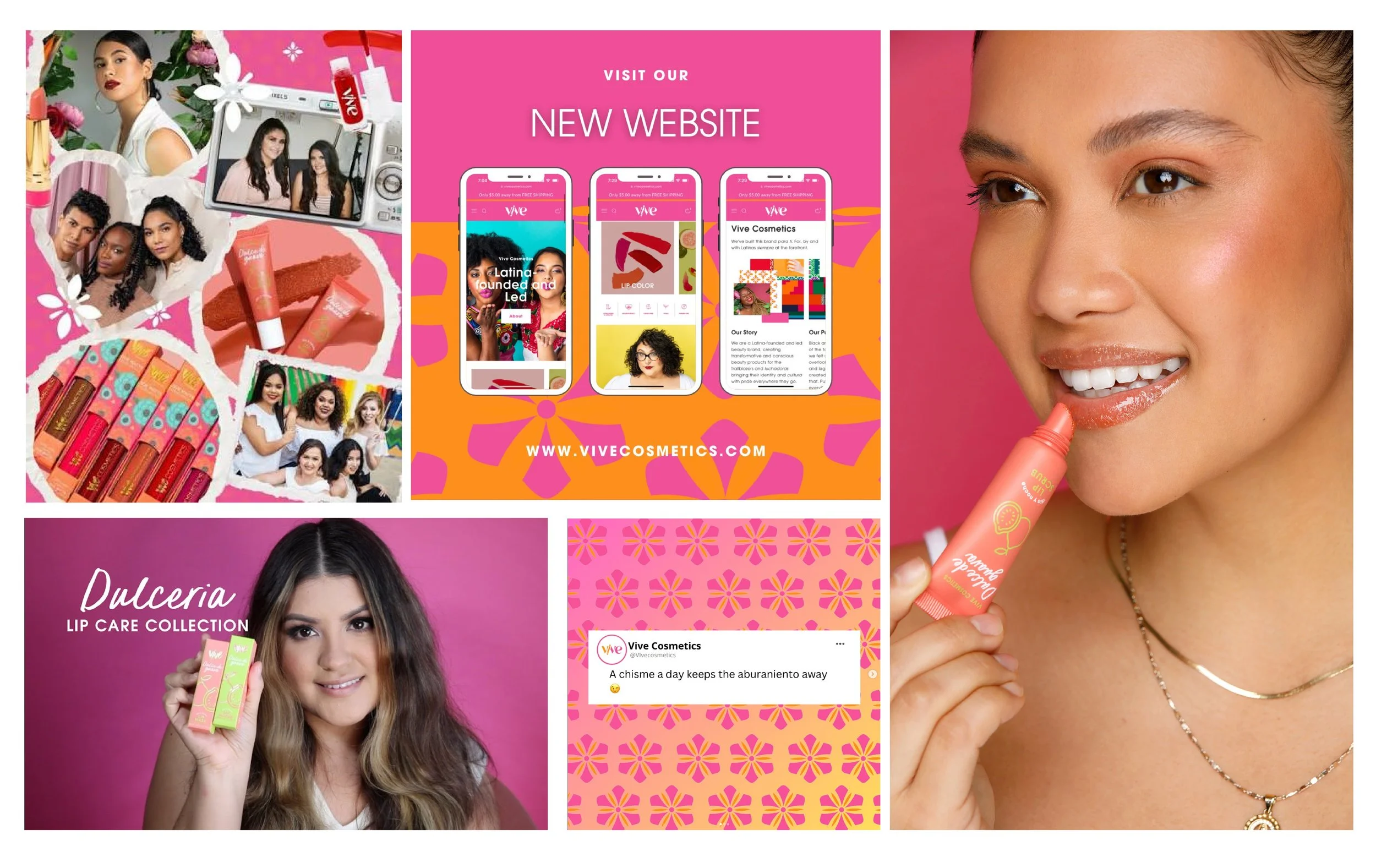
The refreshed identity launched as a more contemporary expression of Vive — brighter, more flexible, and more refined, while remaining connected to the culture and community at the heart of the brand. Rather than replacing what audiences already loved, the new system gave Vive a stronger visual foundation to grow from.